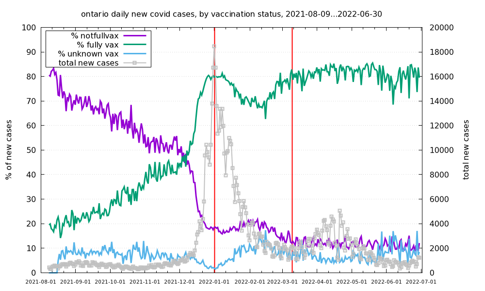
Here is a handy little chart, updated daily, about the Ontario covid new-cases situation. I'll keep it running as long as Ontario's health bureaucrats allow the public to see this data. It's simply a time series of new covid cases since August 2021, broken down by vaccination status. When the data was first released, there was plenty of mockery of the purple points. For some reason, not so much now.
EDITED 2021-12-14:
By popular request, here is a matching data set about covid hospitalization (incl. ICU), broken down by vaccination status. This is not daily admission but total occupancy of Ontario's apprx. 22000+2000 (acute+ICU) beds. It is also not a count of people in hospital because of covid - any patient admitted for any condition gets a routine covid test these days. Here's some fresh UK data on that, Ontario data strangely absent. Any bets about when these blue and purple lines will cross?
EDITED 2021-12-26:
Well, that didn't take long for non-ICU hospitalization, so reworking the graphic to show ICU (thin lines) and non-ICU hospital (thick lines) separately. Sorry that it's a bit messier to read.

PS. These are not per-capita rates (events occurring per cohort of 100,000 unvaccinated people, for example). These are absolute numbers (total events occurring). One can't divine vaccine efficacy estimates solely from these - then again, it's tricky to do from per-capita rates too. But the trends make these figures compelling in their own right.